5. Gene Embedding Analysis Tutorial
In this notebook, we explore gene embeddings as a framework for de novo gene program discovery. Genes grouped into the same program may represent coordinated biological functions and can serve as candidate targets for downstream perturbation studies.
We use an AnnData object constructed from extracted gene embeddings (Notebook 4), where each observation corresponds to a gene at a specific timepoint and the matrix X contains the associated embedding vectors.
Load the libraries
import scanpy as sc
import matplotlib as mpl
import numpy as np
import pandas as pd
import anndata as ad
import gseapy as gp
import seaborn as sns
import matplotlib.pyplot as plt
from adjustText import adjust_text
Here, we load the .h5ad object that contains both the cell and gene embeddings generated by PerturbGen (described above). The cell embedding is computed as the average of the embeddings of all genes within that cell.
adata = sc.read('/lustre/scratch126/cellgen/lotfollahi/dv8/trace/T_perturb/cytomeister/plt/res/lps/embedding_100mMedE0e7_int_2k_all_tps_lps/embeddings/20250715-12:10_inference_embs_t[1, 2, 3]_scmaskgit_mcosine.h5ad')
For each timepoint, the model provides gene embeddings stored in varm, while cell embeddings are available under cls_embeddings.
adata
AnnData object with n_obs × n_vars = 69433 × 2000
    obs: 'cell_pairing_index', 'time_after_LPS', 'cell_type_harmonized', 'batch', 'cell_idx'
    var: 'token_id'
    obsm: 'cls_embeddings'
    varm: '10h_LPS', '6h_LPS', '90m_LPS'
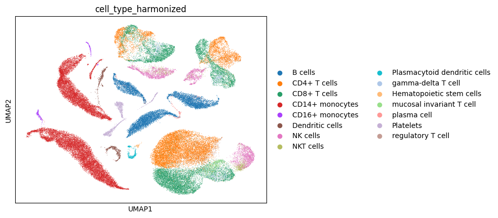
Optionally, cell type labels are renamed for consistency. Cell embeddings can then be used for neighborhood graph construction and UMAP visualization.
mapping = {
    'B cell': 'B cells',
    'CD14 monocytes': 'CD14+ monocytes',
    'CD16 monocytes': 'CD16+ monocytes',
    'CD4+ T cells': 'CD4+ T cells',
    'CD8+ T cells': 'CD8+ T cells',
    'Dendritic cells': 'Dendritic cells',
    'NK': 'NK cells',
    'NKT': 'NKT cells',
    'Plasmocytoid dendritic cell': 'Plasmacytoid dendritic cells',
    'hematopoietic stem cell': 'Hematopoietic stem cells',
    'platelet': 'Platelets'
}

adata.obs['cell_type_harmonized'] = adata.obs['cell_type_harmonized'].cat.rename_categories(
    {cat: mapping.get(cat, cat) for cat in adata.obs['cell_type_harmonized'].cat.categories}
)
sc.pp.neighbors(adata,use_rep='cls_embeddings') # compute the neighborhood graph
sc.tl.umap(adata) # compute the UMAP coordinates
sc.pl.umap(adata,color='cell_type_harmonized') # plot the UMAP with cell type coloring
/software/cellgen/team361/am74/envs/scvi/lib/python3.10/site-packages/tqdm/auto.py:21: TqdmWarning: IProgress not found. Please update jupyter and ipywidgets. See https://ipywidgets.readthedocs.io/en/stable/user_install.html
  from .autonotebook import tqdm as notebook_tqdm
At this step, we use the original data to get a mapping dictionary so we can translate the Ensembl IDs in the gene embedding object into readable gene symbols.
adata_full = sc.read('path/to/original_full_dataset.h5ad')
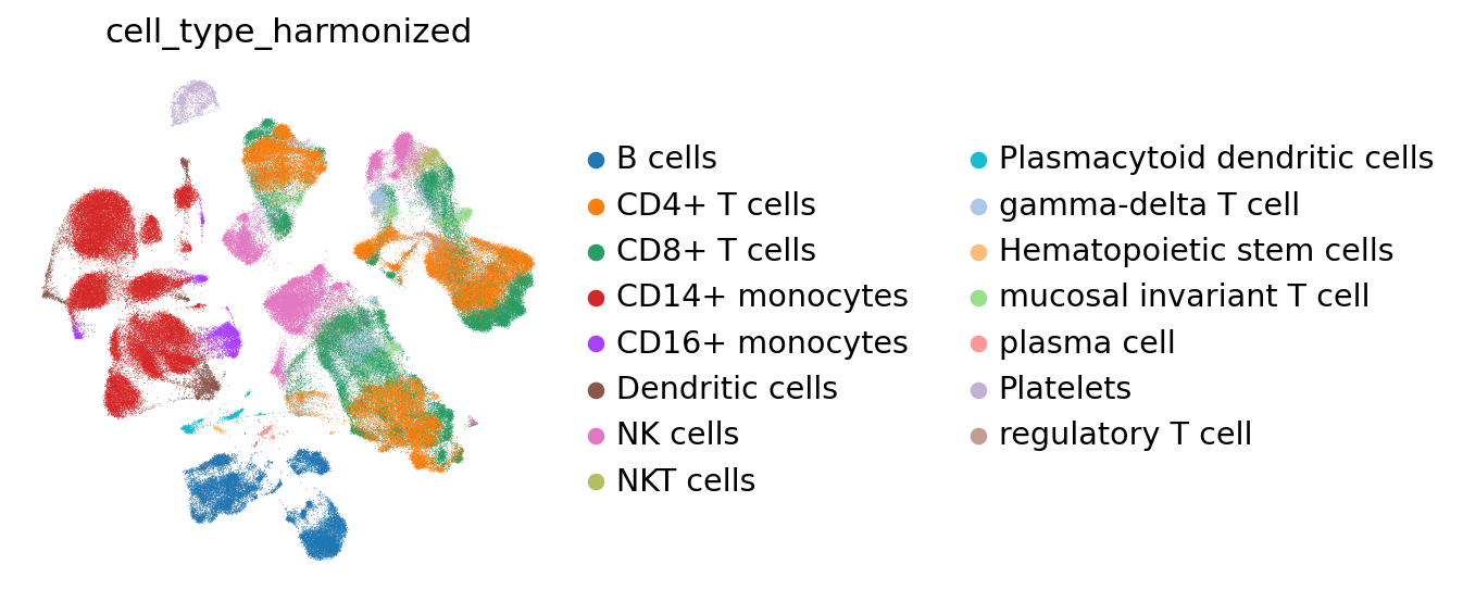
We normalize and log-transform the original AnnData object to generate a baseline UMAP visualization. This optional step serves primarily as a comparison to the UMAP derived from PerturbGen cell embeddings.
sc.pp.normalize_total(adata_full) # normalize the data
sc.pp.log1p(adata_full) # log-transform the data
sc.pp.neighbors(adata_full) # compute the neighborhood graph
sc.tl.umap(adata_full) # compute the UMAP coordinates
/software/cellgen/team361/am74/envs/scvi/lib/python3.10/site-packages/scanpy/neighbors/__init__.py:586: UserWarning: You’re trying to run this on 13826 dimensions of `.X`, if you really want this, set `use_rep='X'`.
         Falling back to preprocessing with `sc.pp.pca` and default params.
  X = _choose_representation(self._adata, use_rep=use_rep, n_pcs=n_pcs)
mapping = {
    'B cell': 'B cells',
    'CD14 monocytes': 'CD14+ monocytes',
    'CD16 monocytes': 'CD16+ monocytes',
    'CD4+ T cells': 'CD4+ T cells',
    'CD8+ T cells': 'CD8+ T cells',
    'Dendritic cells': 'Dendritic cells',
    'NK': 'NK cells',
    'NKT': 'NKT cells',
    'Plasmocytoid dendritic cell': 'Plasmacytoid dendritic cells',
    'hematopoietic stem cell': 'Hematopoietic stem cells',
    'platelet': 'Platelets'
}

adata_full.obs['cell_type_harmonized'] = adata_full.obs['cell_type_harmonized'].cat.rename_categories(
    {cat: mapping.get(cat, cat) for cat in adata_full.obs['cell_type_harmonized'].cat.categories}
)
sc.set_figure_params(dpi_save=600) # set high dpi for saved figures
mpl.rcParams.update({ # set global matplotlib parameters
    "font.family": "sans-serif",
    "font.size": 18,
    "pdf.fonttype": 42,
    "ps.fonttype": 42,
    "svg.fonttype": "none"
})

sc.pl.umap( # plot UMAP of full data
    adata_full,
    color='cell_type_harmonized',
    frameon=False,
    save='_umapcelltype.png'
)
WARNING: saving figure to file figures/umap_umapcelltype.png
Here, Ensembl gene IDs in the gene embedding object are matched to their corresponding gene symbols from the original dataset.
adata.var['gene_symbol'] = adata.var.index.map(adata_full.var['gene_symbol-0'])
We construct a new AnnData object in which each gene is treated as an observation (analogous to a cell), and its features correspond to a n(here =768)-dimensional learned embedding vector rather than expression values. This representation enables standard single-cell analysis workflows, such as UMAP visualization and clustering, to be directly applied to gene embeddings.
gene_symbols = adata.var['gene_symbol'].values
timepoints = list(adata.varm.keys())

all_embeddings = []
obs_names = []
obs_timepoints = []
obs_genes = []

for tp in timepoints:
    embedding = adata.varm[tp]
    all_embeddings.append(embedding)

    obs_names.extend([f"{g}_{tp}" for g in gene_symbols])
    obs_genes.extend(gene_symbols)
    obs_timepoints.extend([tp] * len(gene_symbols))

X = np.vstack(all_embeddings)

obs = pd.DataFrame({
    "gene_symbol": obs_genes,
    "timepoint": obs_timepoints
}, index=obs_names)

new_adata = ad.AnnData(X=X, obs=obs)
Identify gene–timepoint vectors whose embedding values are all zero and report how many such cases exist.
zero_mask = (new_adata.X == 0).all(axis=1)

num_all_zero = zero_mask.sum()

print(f"Number of gene-timepoint vectors with all-zero values: {num_all_zero}")
Number of gene-timepoint vectors with all-zero values: 37
new_adata = new_adata[~zero_mask].copy() # Remove all-zero embeddings.
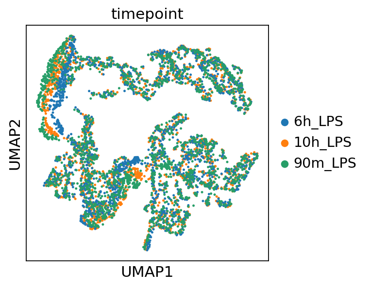
Now we calculate the neighbors and create a UMAP plot for the gene embeddings object.
sc.pp.neighbors(new_adata) # compute the neighborhood graph
sc.tl.umap(new_adata) # compute the UMAP coordinates
/software/cellgen/team361/am74/envs/scvi/lib/python3.10/site-packages/scanpy/neighbors/__init__.py:586: UserWarning: You’re trying to run this on 768 dimensions of `.X`, if you really want this, set `use_rep='X'`.
         Falling back to preprocessing with `sc.pp.pca` and default params.
  X = _choose_representation(self._adata, use_rep=use_rep, n_pcs=n_pcs)
sc.pl.umap(new_adata,color='timepoint') # plot UMAP of gene embeddings colored by timepoint
Gene programs are identified by applying Leiden clustering to the gene embedding space, with each resulting cluster representing a coherent gene program.
sc.tl.leiden(new_adata,resolution=1,key_added='r1') # cluster gene embeddings
/tmp/ipykernel_4059029/1903070418.py:1: FutureWarning: In the future, the default backend for leiden will be igraph instead of leidenalg.

 To achieve the future defaults please pass: flavor="igraph" and n_iterations=2.  directed must also be False to work with igraph's implementation.
  sc.tl.leiden(new_adata,resolution=1,key_added='r1')
For annotating gene programs, we recommend using predefined gene sets as guidance.
results = {}

for cluster in new_adata.obs['r1'].unique():
    cluster_genes = new_adata.obs.loc[new_adata.obs['r1'] == cluster, 'gene_symbol'].tolist()

    enr = gp.enrichr( # perform gene set enrichment analysis
        gene_list=cluster_genes,
        gene_sets= ['GO_Biological_Process_2025','Reactome_Pathways_2024'],

        organism='Human',
        outdir=None,
        cutoff=0.5
    )

    results[cluster] = enr.results.sort_values('Adjusted P-value').head(5) # store top 5 results per cluster
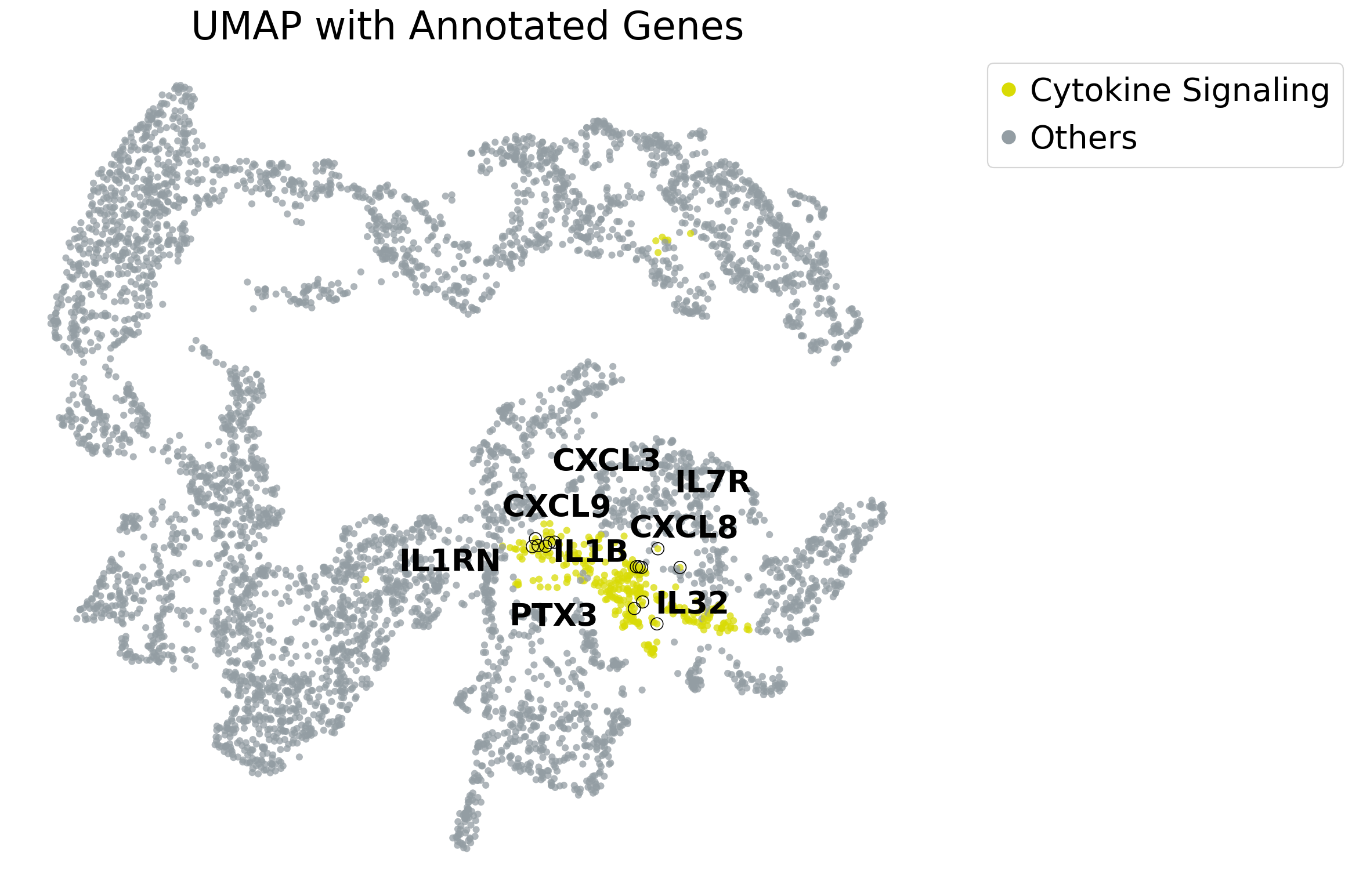
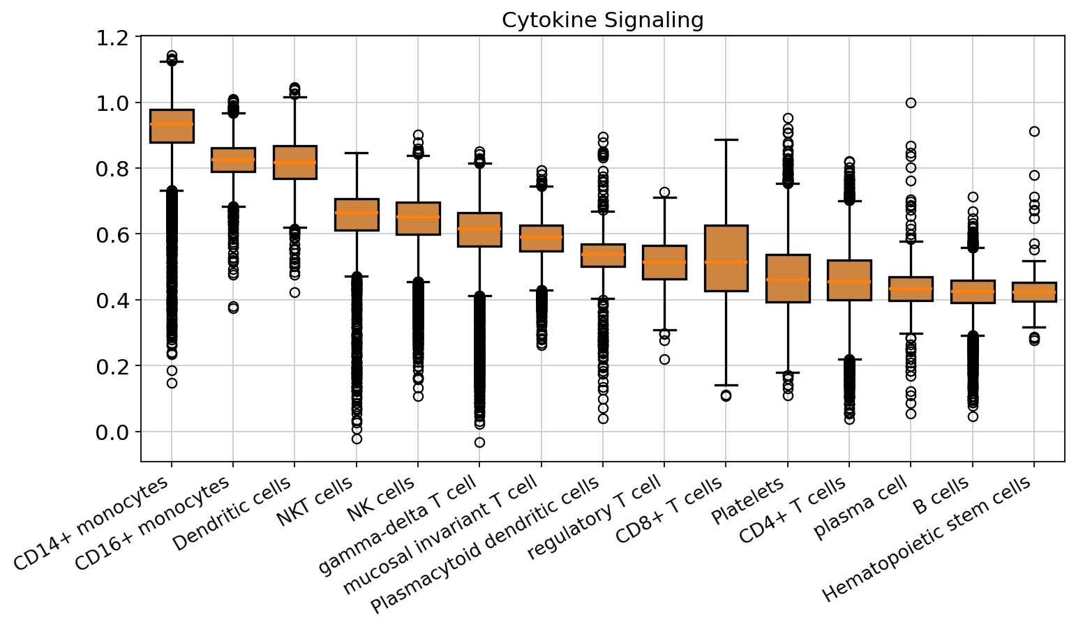
As an example, we annotate cluster 6 as cytokine signaling, since it contains many interleukins and chemokines. You can also calculate the z-score expression of any gene program of interest within the cell space.
adata_full.var_names = adata_full.var['gene_ids-0'] # ensure var_names are gene IDs
genes_cluster_6 = list(new_adata[new_adata.obs['r1']=='6'].obs['gene_symbol'])

genes_present = [g for g in genes_cluster_6 if g in adata_full.var_names]

sc.tl.score_genes(adata_full, gene_list=genes_present, score_name='Cytokine Signaling') # compute gene set score
cluster_map = {
    '6': 'Cytokine Signaling',
}

new_adata.obs['MoA'] = new_adata.obs['r1'].map(cluster_map).fillna('Others') # annotate clusters with MoA labels
Visualize the UMAP and highlight the cluster containing the genes of interest.
highlight_dict = {
    'Cytokine Signaling': ["IL1RN", "IL1B", "PTX3", "IL32", "IL7R","CXCL8","CXCL3","CXCL9"],
}
custom_colors = {
    'Cytokine Signaling': '#d9db05',
    'Others': '#939da3',
}


umap_df = pd.DataFrame(new_adata.obsm['X_umap'], columns=['UMAP1', 'UMAP2'])
umap_df['MoA']  = new_adata.obs['MoA'].astype(str).values
umap_df['gene'] = new_adata.obs['gene_symbol'].astype(str).values

present = sorted(umap_df['MoA'].unique())
palette = {k: custom_colors.get(k, '#939da3') for k in present}

plt.figure(figsize=(15, 10))
sns.scatterplot(
    data=umap_df, x='UMAP1', y='UMAP2', hue='MoA',
    palette=palette, linewidth=0, alpha=0.75, s=30
)
plt.title('UMAP with Annotated Genes', fontsize=30)
plt.xlabel('UMAP1', fontsize=24); plt.ylabel('UMAP2', fontsize=24)
plt.axis('off'); plt.grid(False)

texts = []
for moa, genes in highlight_dict.items():
    for gene in genes:
        mask = (umap_df['gene'].str.upper() == gene.upper()) & (umap_df['MoA'] == moa)
        if not mask.any():
            mask = (umap_df['gene'].str.upper() == gene.upper())

        if mask.any():
            plt.scatter(
                umap_df.loc[mask, 'UMAP1'],
                umap_df.loc[mask, 'UMAP2'],
                s=90, linewidths=0.7, edgecolors='k', facecolors='none', zorder=5
            )

            x_med = umap_df.loc[mask, 'UMAP1'].median()
            y_med = umap_df.loc[mask, 'UMAP2'].median()
            jitter_x = x_med - 1.0 if gene == "IL1RN" else x_med + np.random.uniform(-0.5, 0.5)
            jitter_y = y_med + np.random.uniform(-0.5, 0.5)

            texts.append(
                plt.text(jitter_x, jitter_y, gene,
                         fontsize=24, fontweight='bold', ha='center', va='center', zorder=6)
            )

adjust_text(
    texts,
    expand_points=(15, 15),
    expand_text=(10, 10),
    force_points=5.0,
    force_text=5.0,
    pad=10.0,
    only_move={'points': 'xy', 'text': 'xy'},
    autoalign='xy',
    lim=1500
)

handles = [plt.Line2D([0], [0], marker='o', color='w',
                      markerfacecolor=palette[k], markersize=12) for k in present]
plt.legend(handles=handles, labels=present, bbox_to_anchor=(1.05, 1), loc='upper left', fontsize=25)

plt.tight_layout()
plt.savefig('umap_highlight_gene_symbol.png', dpi=600)
plt.show()
Optionally, you may visualize the z-score expression of a gene program of interest, stratified by cell type or another relevant variable.
mpl.rcParams.update({
    "font.family": "sans-serif",
    "font.size": 18,
    "pdf.fonttype": 42,
    "ps.fonttype": 42,
    "svg.fonttype": "none"
})


df = adata_full.obs[['cell_type_harmonized', 'Cytokine Signaling']].dropna()

ordered_cell_types = (
    df.groupby('cell_type_harmonized')['Cytokine Signaling']
      .median()
      .sort_values(ascending=False)
      .index.tolist()
)

data = [df.loc[df['cell_type_harmonized'] == ct, 'Cytokine Signaling'].values
        for ct in ordered_cell_types]

fig, ax = plt.subplots(figsize=(10, 6))
bp = ax.boxplot(
    data,
    patch_artist=True,
    labels=ordered_cell_types,
    widths=0.7,
    medianprops=dict(linewidth=2),
    whiskerprops=dict(linewidth=1.5),
    capprops=dict(linewidth=1.5),
    boxprops=dict(linewidth=1.5)
)

for box in bp['boxes']:
    box.set_facecolor('peru')

ax.set_title('Cytokine Signaling')
plt.setp(ax.get_xticklabels(), rotation=30, ha='right', fontsize=12)
fig.tight_layout()
fig.savefig("./cytokine_signaling_boxplot.png", dpi=600, bbox_inches='tight', format='pdf')
plt.show()
/tmp/ipykernel_4059029/4172334640.py:13: FutureWarning: The default of observed=False is deprecated and will be changed to True in a future version of pandas. Pass observed=False to retain current behavior or observed=True to adopt the future default and silence this warning.
  df.groupby('cell_type_harmonized')['Cytokine Signaling']
/tmp/ipykernel_4059029/4172334640.py:23: MatplotlibDeprecationWarning: The 'labels' parameter of boxplot() has been renamed 'tick_labels' since Matplotlib 3.9; support for the old name will be dropped in 3.11.
  bp = ax.boxplot(
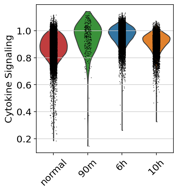
We subset the data to the myeloid lineage, as the gene program was highly enriched in these cells. We then examined the gene program scores within the myeloid population across different timepoints.
myeloids = adata_full[adata_full.obs['cell_type_harmonized'].isin(['CD14+ monocytes','CD16+ monocytes','Dendritic cells'])].copy()
s = myeloids.obs['time_after_LPS'].astype('category')

rename_map = {
    '90m_LPS': '90m',
    '6h_LPS':  '6h',
    '10h_LPS': '10h',
    'normal':  'normal',
}
s = s.cat.rename_categories({k: v for k, v in rename_map.items() if k in s.cat.categories})

new_order = ['normal', '90m', '6h', '10h']
s = s.cat.reorder_categories(new_order, ordered=True)

myeloids.obs['time_after_LPS'] = s

palette = {
    'normal': '#d62728',
    '90m':    '#2ca02c',
    '6h':     '#1f77b4',
    '10h':    '#ff7f0e',
}
myeloids.uns['time_after_LPS_colors'] = [palette[c] for c in s.cat.categories]
sc.pl.violin(myeloids,keys='Cytokine Signaling',groupby='time_after_LPS',rotation=45,save='myeloids.png') # plot violin plot of Cytokine Signaling score in myeloid cells
WARNING: saving figure to file figures/violinmyeloids.png